Showing posts with label Architecture. Show all posts

Giving Old Spaces New Paint Jobs


In my review of Kinke Kooi's exhibition Let Me Comfort You at Feature Inc. and William Swanson's show Architectonic (seen above) at DCKT Contemporary, I address how each artist takes a different approach to revising and reappropriating generic architectures. Kooi's meticulous collage, drawing and painting imagines enveloping, textured spaces of sexual, psychological and sensual intimacy. Swanson, meanwhile, envisions brilliantly kaleidoscopic acid trips through abandoned interiors and blighted lots. While his neon paintings are more visually engaging and spectacular, Kooi offers a kind of personal optimism against Swanson's popular pessimism. Read the whole review here.

Site Review: Selling the New Cool(haas)


Located in Manhattan’s fashion, design and gallery district Soho, the sales office for Rem Koolhaas and the Office for Metropolitan Architecture’s (OMA) new residential tower 23e22 stages itself as an artwork and luxury lifestyle space rather than a home. The choices of design, media and location for the sales office address several marketing and branding problems inherent in the high-rise condominium tower project, and build on Koolhaas’ previous projects in New York. 23e22 – still in the early stages of construction – is located in a relatively quiet area where office employees account for most of the foot traffic and daily activity. The choice of Soho for the sales office maximizes walk-in traffic and visibility. The neighborhood’s various associations with the cutting edge in fashion and design also lend the building a chic glamour that is reflected in the various advertising materials, renderings and related media that have accompanied the building’s marketing campaign. Additionally, the space’s design reflects Koolhaas and OMA’s typically adventurous promotional style and the building’s luxury branding and target demographic.

The 23e22 sales office at 27 Mercer Street (between Canal and Grand Streets) occupies the entire ground floor of a landmarked loft building near the southern edge of Soho. The space is organized in and around a scale model of 23e22 lying on its side. The building’s design starts from a narrow base (33 feet) and rises over the shorter structures to the East as it expands to nearly twice its width (63 feet) before narrowing again in its top floors. As a result, the horizontal model creates a slow staircase in the sales office. Within this grid-marked, sloping space, two models of the building offer details of its exterior surface and its location amid neighbors – including the nearly completed 60-story tower One Madison Park, with which it shares a ground floor multi-purpose space. Copies of Koolhaas’ S, M, L, XL are arranged throughout the space and certain windows give onto the hallway that snakes around the giant model. In some of these windows, small models of the conical ground floor lobby and screening room provide a sense of 23e22’s public entrance. The U-shaped hallway that leads around the outside of the model features a view of the skyline overlaid with 23e22’s metallic grid façade pattern on one side, a small lounge space and kitchen near the back, and a wall of information about the building, its design concept, its relationship to neighboring One Madison Park and the work of OMA.

The 23e22 sales office deploys a variety of media to support and heighten the condominium building’s visual and architectural appeal. Some of the mediated texts incorporated into the design are very traditional: the inclusion of Koolhaas’ famous book S, M, L, XL is a strong signifier of class, educational background and taste that addresses a very specific audience; the prevalence of architectural renderings and models assumes a certain level of literacy for such graphic representations; meanwhile these representations’ frequent repetition throughout the space elevate their status to art objects – another symptom of the sales office’s location in what used to be New York’s foremost art gallery district. The model of the ground floor screening room – a partnership with Creative Artists Agency (CAA), one of the entertainment industry’s foremost talent agencies – invokes another mediation structured around private screenings and exclusive film-related events.

The space’s construction also turns the building model itself into a medium, framing views of a wall-sized skyline photograph that simulates 23e22’s most exclusive views to the North (views only made available by the building’s spectacular 30 foot cantilever). The sales office itself also acts as a medium, representing the official marketing and information campaigns for a building still in the earliest stages of construction. The real building may not be finished yet, but its existence in so many other forms functions as a guarantee. The wall of digital renderings, charts, maps, cross-sections and texts explaining the design apply the language and presentational mode of museum displays, thereby implying the project’s value as art. The rhetoric that develops from the various media in use at the 23e22 sales office frames the building alternately as a luxury good for consumption and an art object for aesthetic appreciation.
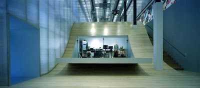
That dialectic between art and commerce stems from and informs much more than 23e22’s overt media representations. It also issues from Koolhaas’ portfolio of work – especially in New York – the partnership with CAA, Soho’s fluctuating neighborhood identity and the previous role of the sales office’s building at 27 Mercer Street. 23e22 will be Koolhaas and OMA’s first new building in New York, but the architect and his studio have designed several interiors in the city, all of which are organized for the presentation and consumption of media. Most famously, the Prada store (pictured above) very near the 23e22 sales office in Soho was designed to incorporate a programmable public venue in its staircase-shaped performance venue. Predictably, this hybrid of public and private space and programming has been unsuccessful, and the Prada store maintains the brand’s exclusivity. This stair-shaped performance space is re-cast in 23e22 as a screening room that will be visible from the street, but exclusively for the use of residents and CAA events. Here again, Koolhaas/OMA strikes a tenuous balance between public space and accessibility, and one wonders who will receive priority the day 23e22 residents and CAA clients try to use the screening room at the same time.

Another stair-shaped interior Koolhaas has designed in New York is the Second Stage Theatre at 43rd Street and Eighth Avenue in Midtown (pictured at right). Here the ongoing dialectic between art and commerce inherent to the Prada store and 23e22 sales office’s location in Soho recurs within the dual role of Midtown Manhattan as a business and theater district. Adding to this contrast, the Second Stage Theatre is housed in a landmarked bank building. Rather than refurbish the interior, Koolhaas kept the majority of the building’s details (the box office is inside the old bank vault). By inserting seating into the main bank space, areas behind and in front of the stair-like structure become a lobby and stage. This simple manipulation of negative space creates an incredibly effective space that is an excellent performance venue and highlights the architectural grandeur of the original bank building. A similar rhetorical strategy is at work in the 23e22 sales office, whose gradual stairs evoke both a stage and seating. Here, though, the spectacle on display is the multiplicity of representations of 23e22, shining under elaborately designed lighting. As much as a performance space, the sales office also evokes an art gallery.

Not surprisingly, Koolhaas/OMA’s most similar New York design to the 23e22 sales office is an art gallery in Chelsea – the neighborhood that displaced Soho as the city’s foremost gallery district. For Lehmann Maupin’s Chelsea space (at right), Koolhas/OMA inserted a plywood trapezoid into the ground-floor warehouse, creating a main room with adjoining offices, side galleries and reception. By inserting a new construction into the gallery, Koolhaas/OMA effectively turned Lehmann Maupin into a permanent display space for their structure. The distinction between the art and the architecture that organizes it becomes increasingly blurry, an ambiguity the 23e22 sales office takes a step further. At 27 Mercer the space is the artifact being displayed and it organizes the gallery to display itself. However, this paradigm of installation art and architectural modeling works as a sales mechanism, creating an immersive experiential space midway between a gallery and a boutique that doesn’t necessarily give any sense of the homes in 23e22, but mimics its structural daring.

This confluence of the architectural rhetorics of visual art and conspicuous consumption is all the more fitting given the sales office’s location in Soho – once the most vibrant gallery district in the world and now mostly an open-air luxury goods mall. A coincidental but no less telling symptom of Koolhas/OMA’s use of art display paradigms to sell 23e22, one of the previous tenants of 27 Mercer Street was the gift shop of the Guggenheim Museum before it moved to its Frank Lloyd Wright building Uptown. Turning iconic artifacts into objects for consumption is in the space’s walls, as it were. In addition to luxury housing and architectural spectacle, the sales office offers the cultural cachet of Koolhaas/OMA as part of its sales pitch. An entire section of the wall space is devoted to detailing the work and style of the international architectural office – referred to in one section as “a leading international partnership practicing contemporary architecture, urbanism and cultural analysis.” In addition to an exclusive, luxury item and limited edition art object, the 23e22 sales office is selling Koolhaas/OMA.

The sales pitch isn’t completely convincing though, and certain elements of the sales office don’t match the building’s veneer of spectacularly affluent exclusivity. The lack of a typical apartment interior image is striking – the only unit showcased in any detail is the top floor’s $45 million penthouse. The lounge at the back of the sales office (at right) presents a disjuncture between Koolhaas/OMA’s frequent use of neon colors (especially orange and green) and 23e22’s prevalent aesthetic of black, metallic silver and glass. Here, foam chairs in playful shapes and colors break with the self-serious luxury branding of the sales office and building – a mismatched effect furthered by a carpet made to resemble green lawn. The nearby kitchen nook is similarly incongruous, with its neon yellow walls and stack of cookbooks. While the rest of the sales office categorically excludes any details of daily life in its representations of 23e22, here suddenly the effect falls apart. Marketed as a space for looking (its very form is predicated on peeking past its tall neighbor to create views to the North) and being looked at, this slippage admits the very mundane activities like cooking and relaxing that go unmentioned throughout the rest of 23e22’s sales media.

With these various marketing strategies and media displays, the sales office for Rem Koolhaas/OMA’s 23e22 deploys visual and rhetorical strategies familiar from various other media to selling luxury housing. The space alternately recalls an art gallery, a museum, a luxury goods boutique and an art installation. These effects are heightened by the office’s location in Soho and Koolhaas/OMA’s previous projects in New York, all of which are straddled between the worlds of art and commerce, seeing and buying, contemplation and consumption. Despite this formidable marketing machine and spatial-visual experience, certain details bare testament to the very rudimentary functions this art building must fulfill as a functional home for its exclusive clientele.

Reading Response 6 (Week 10)

I found all this week’s readings extremely interesting, especially Pierluigi Serraino’s discussion of the class-coded visual lexicon used in architectural photography and James S. Ackerman and Robert Ewall’s retracing of the practice’s roots in landscape paintings, travel literature, engravings, and early photography. Most enlightening, though, were the strange similarities and contrasts between Serraino’s discussion of the parallel careers of the architect and her/his photographer, and Ackerman’s allusion to conservation efforts built around architectural photography. These two uses for images of buildings call to mind two opposite impulses: using photography to immortalize a particular vision of architecture; and using photography as part of an argument for the conservation of the actual building. Photography suddenly serves a double purpose with respect to architecture: freezing a building in a specific time and state for diffusion far from its physical location; and providing evidence of a building’s merit in its particular state and place.

This immediately evoked two Roland Barthes analyses, The Death of the Author and Camera Lucida, both of which address an interpretive obsession with authenticity. In the former Barthes questions the necessary validity of authorial intentions, instead arguing that great works of art can and should produce different interpretations upon each reading. In Camera Lucida, Barthes contemplates the strange temporal dislocations introduced by photography, suggesting that its subjects are inherently ghostly because the moment captured on film is immediately gone. The collaborative artwork of architectural photography, and its use in conservation campaigns introduces an interesting ripple to this discussion.

After all, as we’ve discussed since the beginning of the semester, architecture is among the most polysemic of artworks, its interpretation at least slightly different for each viewer. Architectural photography, especially the variety discussed by Serraino, seems aimed at fixing a building’s interpretation based on one or a series of author-approved images. Here, then, the architectural photographer could be said to be imposing a particular interpretive articulation of a building. As Barthes might put it in The Death of the Author, architectural interpretation is focused and restrained by the author’s selective photograph imagery. Meanwhile, photography for conservation purposes presents a different, contradictory interpretive paradigm. Here, the image becomes a kind of argument for the importance of the building itself. By highlighting certain unique features and qualities, the architectural conservation photograph presents an argument for the value of the original building. The photograph isn’t intended as an art object in its own right (though it may become one, as Ackerman shows), but instead serves as proof of a (potentially) lost original. Architectural photography, it seems, substitutes itself for the building as the object of interpretive significance. These disjunctures point to a more fundamental question recurring throughout this class: the inherent un-reproducibility of architecture and the persistent obsession with trying to represent it in various mediated reproductions.

Reading Response 5 (Week 9)

Jean-Louis Cohen and Beatriz Colomina's analyses of Le Corbusier's integration of various media to further his architectural projects underlined something we often forget: the various distortions that images of a building or project can introduce to the actual design. Colomina puts this most bluntly on page 15 of "Le Corbusier and Photography", writing: "Images are not used to 'illustrate' the text; rather they construct the text." Nicolai Ouroussoff's New York Times article of April 20, 2008 entitled "Now You See It, Now You Don't" addresses similar concerns: the manipulative digital constructions and pseudo-photographic representations architects and developers use to promote their projects. Here, as in Colomina's Le Corbusier examples, doctored images hold as much weight as buildings themselves: the distinction between sign and referent, object and image breaks down.

Ouroussof's larger argument – something Colomina avoids in favor of portraying Le Corbusier as a pioneering guru of photography and advertising – was that completed constructions can be extremely disappointing if these representations are looked at uncritically. This is clearly a problem in New York today, where luxury condo developments come with high-concept visual campaigns. Finished, some look passable at a distance, but they're often poorly constructed and designed from street level and inside. This same problem – prioritizing mediated views over embodied experience – struck me in the two Le Corbusier buildings I'm most familiar with: the Unité d'Habitation housing project in Marseille (1952) and the Notre Dame du Haut chapel in Ronchamp (1954).

Both are in relatively isolated settings, nearly "eliminating the site," and "mak[ing] architecture into an object relatively independent of place" (Colomina 4). In Ronchamp this isn't so problematic. Ascending a steep hill from the village towards the building turns the visit into a kind of pilgrimage, and the beautiful site offers terrific vistas onto the surrounding valley. Even here, though, architecture seems organized especially for photographic and filmic vision. Observed from the access road or village below (as seen at top), the chapel appears as it was intended to be seen: a building both dominant and soft, posturing while peeling back its roof and corners with inviting curves. From the other side (only accessible on foot), the building is completely mediocre (as seen above).

The shortcomings of Le Corbusier's Unité d'Habitation are much greater. The building features over 300 apartments, housing a veritable village within its suspended structure. Located off a six-lane parkway far from the dense city grid, the building's cast concrete structure sits on pylons, lifting it off the ground (as seen at right). This impressive feat of engineering isolates inhabitants from the surrounding geography, forcing all community activities onto a roof terrace (seen below) that features beautiful views but fosters insularity. Here, again, what Le Corbusier dubbed "machines for living" may actually be "machines for seeing." How ironic that one of New York's most spectacular buildings under construction – Jean Nouvel's 100 Eleventh Avenue – was dubbed "the vision machine" but will, judging from the site and structure so far, be a disappointing living machine. Such discrepancies are the highest stake in this art of architectural representation.

Best of Art 2008

Best Illegal Public Art
Move over graffiti, impromptu street welding is the new mode of rebellion for disenfranchised urban youth. Manhattan got its first taste in the form of inaccessible public seating – a bench installed with risers 8 feet off the ground on an East Houston median. The Tall Bench lasted a week and its creators never came forth – a cryptic YouTube video records its creation and installation – but its moment in the bloglight made us reflect on the fleeting nature of public space in the churning city, and height-based discrimination.

Best Legal Public Art
Environmentalism is in, so P.S.1's self-referential summer courtyard-straddling urban farm P.F.1, the wacky work of WORK Architecture, is a natural choice. It's made with sustainable materials, softens the hard concrete edges and gravel grounds of P.S.1's front-yard, and yields actual crops! Badges for participation go to Olafur Eliasson's Waterfalls, MoMA's pre-fab housing and the Spring's weird drill/realtime London-linkup on the Brooklyn waterfront.

Best Introduction to an Asia-Centric Art World
We all need to get used to Asia running things, and the Guggenheim's Cai Guo-Qiang retrospective was a good crash course on the Chinese art star's pyrotechnic performances and grandiose installations. Even the Murakami blockbuster at the Brooklyn Museum couldn't outdo Cai's neon-billowing flying cars, cascading wolf wave and log ride-reappropriating water circuit.

Best New Museum
Being the only new museum, The New Museum must be the best new museum in addition to actually being a great new museum (follow?). Its sleek stack of shimmering silver boxes on The Bowery is a great destination for time-strapped art fans, a well-curated best of from the global gallery scene – and with its free Thursday nights still not too crowded it's affordable too.

Best Gallery Show
Survey shows can be spotty, often a gallery-owner's excuse to gloat over her or his accumulated art wealth. Not so with this spring's Who's Afraid of Jasper Johns? at the Tony Shafrazi Gallery, a postmodernist quilting from dealer Gavin Brown and artist Urs Fisher. Overlapping artworks and painted-over murals mashed Keith Haring and Jean-Michel Basquiat up with Francis Bacon, Cindy Sherman, Jeff Koons and Robert Morris. Beyond the envelope-pushing presentation, the jarring arrangements actually made for insightful comparisons.

Best New Building
Even though the now dissipated building frenzy gave us lots of all-glass uglies, there were also some great additions to our built environment. The most remarkable structure that will definitely be completed – currently growing its mesh skin on Cooper Square – is Thom Mayne's Cooper Union building, a spectacular cascading collage of metal layers and impossibly contorted interior atriums.
Best New All-Glass Ugly
When putting together one of those vertical suburbs for multi-millionaire compulsive narcissists, Pritzker Prize-winning architect Jean Nouvel goes balls to the glass wall. After his subdued Soho condos, the Nouvel Chelsea (opening later this year at 19th St and Eleventh Ave) will feature an all-glass facade with over 1,600 individual panels. It probably won't actually be ugly, just a little gross.
This feature will appear in The L Magazine's upcoming Best of New York 2008 issue.

Eminent Domain

New York Public Library
Fifth Avenue and 42nd Street

These six New York-based artists explore blurry borders between the city’s public and private space. Four photographers document private citizens’ tactics for reconciling personal and urban rituals, another explores the encounter between municipal bureaucracy and urban fringes, and the last recounts his personal journey around the city through apartments.
Zoe Leonard’s series Analogue takes after Eugene Atget’s photographs of Parisian storefronts in the early 20th century. Her work immortalizes today’s disappearing window displays of old-New York retailers on the Lower East Side and in parts of Brooklyn. In Untitled/This is just to say, Ethan Levitas uses elevated subway cars in Brooklyn and Queens as his own widescreen storytelling settings, capturing poetic moments of unsettling coincidence, stolen glances and intense emotion. Thomas Holton’s series The Lams of Ludlow Street focuses on the titular Chinatown family and their adaptive use of a cramped apartment. Window by Reiner Leist offers a private diary of public space: the photographer’s daily snapshots of Lower Manhattan from his apartment for over ten years. The exhibition’s only glaring faux-pas comes in this series, where the investigation of public and private claims to urban space is subverted in favor of the morbid voyeurism afforded by Leist’s view of the World Trade Center towers. Where the rest of the show challenges viewers, this decision is an unfortunate capitulation to the lowest common denominator.
In borough edges, nyc (which can be seen in its sweeping totality here) Bettina Johae traces the official boundaries of the city as accurately as public accessibility allowed her. Images from these blighted fringes alternately reveal industrial waste, household trash and natural splendor. Glenn Ligon’s diary-like narrative of different apartments and neighborhoods he’s lived in – including two moves motivated by eminent domain disputes – recurs throughout the show. These paragraph entries offer a mix of private and public insights, and provide text-based relief between the different photo series.
Concentrated in the New York Public Library Bryant Park building’s main exhibition space, fragments from each series are peppered throughout the building. This stroke of curatorial creativity ensures that issues broached in the gallery will extend to other areas, leading viewers to keep engaging the public/private divide as it plays out in different spaces. Similarly, the solicitation of viewer contributions on the exhibition website means attendees will continue to address the ownership of urban space on their own terms.
A similar review will appear in an upcoming issue of The L Magazine.

New York in Flux


Last Thursday – amidst sleet and freezing rain – I trekked to Long Island City’s artist collective Flux Factory, almost missing their inconspicuous front door, for the opening of their latest exhibition, New York, New York, New York.

Running up the stairs and out of the cold, I nearly tripped on the giant scale model of the five boroughs that takes up almost every inch of floor space in their main gallery. The best way to explore the exhibition’s fantasy space, then, was to walk up and down the city’s rivers and through its harbor, getting a close look at the individual elements while also taking in the spectacle of such an elaborate piecemeal concoction. Many artists had recreated buildings – existing, destroyed, planned and imagined – in various scales and media. Joel Morrison and Hiroshi Shafers, for instance, assembled a floating mixed media effigy of Queens’ awkwardly solitary Citibank skyscraper, bemoaning the tides of corporate invaders and gentrifiers the building foreshadows. Momoyo Torimitsu, on the other hand, conveyed a vision of the Financial District – strikingly evocative of I Am Legend, the current Will Smith capper – in a post-human future, with greenery taking over skyscrapers and an audio track of chirping birds suggesting the return of nature to Lower Manhattan.

Some of the most interesting pieces stood out by using video and audio to grab my attention, which was otherwise pretty much overwhelmed. The most charming piece of this kind – Ian Burns’ “Broadway” – mixed video, toy cars and a treadmill to convey cabs racing down Broadway in a way reminiscent of NASCAR or Tour de France TV coverage. A couple dozen toy cabs are set up on a treadmill, starting and stopping for a miniature traffic light; the head car is mounted with a miniature camera that sends a live video feed of the close-up action to a nearby monitor. The piece was a funny and less jarring replica of the absurd pace of taxi cabs careening down the city streets, tearing off the line at green lights and screeching to a halt a few blocks later.


The terrifying speed of gentrification, meanwhile, was the most frequently recurring theme, though some artists approached it more subtly than others. On the more explicit side of things, the exhibition’s Lounge space featured two variations on arcade games that parodying the desperate state of housing rights in the city. The first, Devrim Kadirbeyoglu’s “Gentri-why?”, lets gallery-goers – for the small fee of 25 cents – try their hand at one of those infuriating skill crane games in which the plush prizes to be picked up are cushion replicas of landmarked Williamsburg buildings. George Spencer, meanwhile, took a machine that ordinarily would distribute jawbreakers and silly little toys, and created “Block Busting.” After depositing four quarters, out rolled a plastic ball containing a chunk of concrete: now I own a little piece of land in New York!

Instead of the mediocre state of New York’s current built environment, many artists resorted to fantasy, imagining impossible buildings or bringing to life fictional ones. Among only four artworks occupying the Staten Island portion of the exhibition was Sandy Amerio’s “Fort Wadsworth.” Though on paper it sounds like a historical recreation, Amerio’s piece is actually concerned with what is under Fort Wadsworth, namely comic book superhero G.I. Joe’s headquarters. Some pages from the eponymous comic tangled in a mess of barbed wire suggested the way our knowledge of the city is tied up in our stories and experiences – both real and fictional.

With over 100 artists contributing to the exhibition, many of the pieces didn’t work as well as these. That said, the overwhelming experience of gazing across such a heterogeneous cityscape, and the satisfaction of the better individual artworks, made the not-so-good art – and the cross-tundra hike out to Long Island City – well worth the effort. Just try to go when it’s not snowing and hailing.

Flux Factory, 38-38 43rd St. (betw. 37th Ave. and Northern Blvd.), 646-226-8611, fluxfactory.org.

Photographs by Benjamin Sutton.
A similar version of this article will appear on the New York Press blog on December 18, 2007.

New Yorkers, Meet your New New Museum

This week-end’s opening event for the New Museum (235 Bowery at Prince) featured free access for 30 continuous hours to the institution’s new Kazuyo Sejima and Ryue Nishizawa/SANNA-designed building, and its exhibition Unmonumental. The museum’s spacious lobby – which might look sparse once normal hours and rates ($12) are put into effect – provided a pleasant and flexible space for visitors. The exhibition in the ground-floor gallery, Young-Hae Chang Heavy Industries’ Black on White, Gray Ascending (on view until March 23rd), cleverly manipulates our expectations to deliver a multi-faceted narrative that rewarded viewers’ prolonged attention. The museum store occupies a section of this ground-floor space, its undulating mesh wall repeating the grid pattern found on the museum’s exterior. A good collection of contemporary art books and museum store knickknacks fills the shelves, and the cleverly ironic “New T-Shirt” tees seemed to be a hit. Meanwhile, the museum’s auditorium and only reasonably-sized bathrooms are located in the basement, as is a captivating mural by Jeffery Inaba saturated with information about arts patronage and philosophical quotations on giving.

Heading up to the galleries (on the second, third and fourth floors) was an undertaking, particularly given the limited elevator space. Taking the stairwell – I’m sorry, the Fern and Lenard Tessler Stairs, apparently mid-range patronage only gets you seven flights of stairs these days – brings visitors to the three floors of the Unmonumental exhibition. Already a bold assault on traditional museum exhibitions, it features only sculptural assemblages right now, but three additional sets of artworks (2-dimensional, audio, web-based) will be incorporated before it ends in on March 23rd 2008. The assortment of three-dimensional collages was certainly uneven, but the whimsical grandeur of the largest works and the minute intricacies of the most complex smaller creations, made up for certain lackluster inclusions. Hopefully the less-interesting pieces in the exhibition will become more compelling when Unmonumental’s subsequent layers are added (2-dimensional on January 16, audio on February 13, web-based on February 15). The galleries themselves (as the building’s silhouette suggests) resembled a few of Chelsea’s gallery spaces stacked on top of each other. The high ceilings, white walls and concrete floors faithfully recreate the gallery atmosphere that – for better or worse – is the preferred viewing environment for contemporary art.

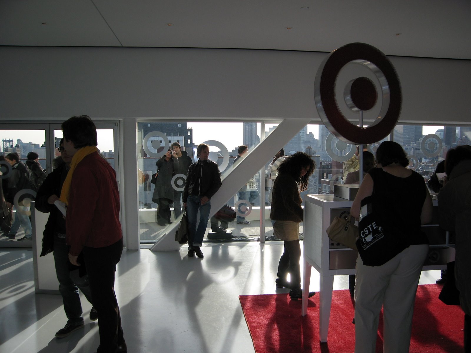
The fifth floor’s education center, with its low ceiling and ugly carpeting, was an awkward and cramped space, particularly difficult to explore when most visitors didn’t understand what it was. Maybe keeping this level closed during the opening event would have made more sense. Climbing to the seventh floor bore the main reward of Target’s 30 Free Hours event, though it would have been difficult to predict: free candy. The museum’s top floor was outfitted with Target-logo decals on the windows, a DJ and a long set of drawers filled with free red and white candy, and adorned with two large Target logos. During the day children and aesthete adults rubbed elbows to get at the free treats, and by the wee hours of the morning the sweets were not so abundant and the crowd not so sweet-toothed – but still a little. At all times, the seventh-floor terrace affords spectacular views in all directions, a fitting reward for climbing seven flights of stairs, and an unusually nice setting for candy-gobbling.

While the New Museum’s opening event was hard to separate from its intriguing architecture and its main exhibition, the effect of all three together was exciting, like glimpsing some moment – however significant only time will tell – of contemporary art history as it happened. Throughout crowds seemed enthusiastic and pleased with what they saw, be it the families and tourists who came during the day, or the assortment of sober and tipsy hipsters and impatient art-lovers hoping to avoid crowds who filled the museum during the night.

For more photographs of the New Museum opening, click here.

A similar version of this post can be viewed on the New York Press blog, here.

All pictures by Benjamin Sutton.

The Hudson Yard Dash

Staking a large portion of their financial future on real estate, the MTA recently revealed five design proposals for the Hudson Yards, which many might remember as the proposed location of an aborted new Jets stadium. The midtown Manhattan site is bordered by 33rd Street to the North, 30th Street to the South, 10th Avenue to the East and the Hudson River to the West. The Hudson Yards is easily the largest development site in Manhattan, and connects to countless other large-scale projects: the Westward extension of the 7 train, the Hudson Boulevard green corridor (running from 33rd street to 42nd street between 10th and 11th Avenues), the renovation or replacement of the Javits Convention Center, the seductive but slow-moving High Line re-development (one third of which lies in the Hudson Yards development area), and the expansion and reconstruction of Penn Station and Madison Square Garden.

The five Hudson Yards development proposals are on public display until December 3 in a small storefront space at 43rd Street and Vanderbilt Avenue (next to Grand Central Station). With posters, videos, models, pamphlets and representatives from each of the development firms, the atmosphere is that of an awkward sales pitch. This discomfort is made worse by the poor quality of the products being hawked: with a few exceptions, the proposals feature uninspired cookie-cutter architecture, speaking to the financial motives behind this project. As a sales rep from Related Companies explained, given its current financial situation, the MTA can’t afford to miss on this project. Cue the conservative aesthetics and corporate concessions: it’s like Ground Zero all over again, except without the public outcry motivated by the site’s symbolic weight.

Three of the least inspired proposals have a clear advantage right out of the gate for attaching a major corporate tenant to their project. The proposal by Related and Goldman Sachs enlists the star power of Rupert Murdoch and his News Corp., and ends up looking like an open-air mall for Mr. Murdoch’s various holdings to pedal their wares from. On the other hand, the presence of three contrasting architecture firms (Arquitectonica, KPF, Robert A. M. Stern) gives the proposal an aesthetic variety absent from many projects of this scale, though not entirely successful.

The partnership of Durst/Vornado – with Condé Nast enlisted as their major tenant – comes with a proposal whose layout is practically identical to the Related/Goldman Sachs entry, minus the apparent architectural eclecticism. Also, this is the only design that does away with a portion of the High Line. Architects FXFowle and Pelli Clarke Pelli have submitted what looks like an unusually tall and well-heeled suburban office park. The predominant glass-tower aesthetic wouldn’t seem so irresponsible if this project didn’t also involve creating a livable neighborhood from scratch – the proposals include between 3,000 and 7,000 housing units, a tokenistic percentage of which will be made permanently affordable.

The proposal by Tishman Speyer comes with the financial backing of Morgan Stanley – who would take up office at the site. To be fair, architect Helmut Jahn and landscape architect Peter Walker have at least come up with something distinctive and retro in their blatantly Modernist arrangement of rectilinear glass towers and heavily-paved public spaces. Retro-charm aside though, this proposal is mostly interesting because it’s not terrible – that doesn’t mean it’s good.

Brookfield Properties’ proposal is lacking a confidence-building corporate tenant, but has made up for it with an all-star team of architecture firms (Skidmore Owings + Merrill, Field Operations, and Diller Scofidio + Renfro among them). Their plan is architecturally spectacular (at least at this early stage), and keeps more of the street grid than any other, countering the suburbanizing tendencies such large-scale developments tend towards. On the other hand, it commits a mistake common to all the proposals to one degree or another: the systematic separation of office (on the East side of the site) and residential buildings (on the West side of the site). How can a neighborhood be safe and vibrant (and financially successful) if half of it is deserted after 6pm?

The most promising proposal comes from Extell Development and architect Steven Holl. Rather than following the other proposals and building a platform over the MTA rail yards – which have to remain operational throughout construction remember – Mr. Holl proposes a suspension bridge extending over the yards to be covered with a valley-shaped park. The plan’s buildings – whose diverse and unusual shapes are the most genuinely original of any proposal – would all lie on the Northern and Southern edges of the site, with offices, retail and residential interspersed throughout. Landscape architect Laurie Olin keeps the park space pleasantly open, with few of the glitzy corporate tie-ins and unnecessary public space gimmicks of the other proposals.

Whatever finally gets built, thankfully, it will likely look nothing like any of these proposals. At worst it will be a complete failure, an ugly office park next to some high-end condos with unused open space in between. At best, with some architectural daring and variety, as much of the street grid as possible, and successful integration with surrounding areas and development projects, an urban and economically integrated neighborhood will grow out of this all.

A similar version of this article appears on the New York Press blog, and can be found here.